Branding: Cornish Orchards Interview

My lovely agents The Artworks have a brand new website and to coincide, they've made a film on each of us, highlighting some of our favourite projects 🎬


Here's mine, where I'm discussing the Cider packaging I illustrated for Cornish Orchards and my process. I was commissioned by the fantastic Outlaw Collective and worked on this pre and mid pandemic. I'm talking very fast to fit everything in to under one minute!

Design and art direction by Outlaw, photography by Tom Skipp. Thank you to Jack at The Artworks for putting the interview and my illustrations and sketches together!

You can check out the new website here: https://lnkd.in/e4efWvN4

Scissorella: Creative Process

I’m delighted to have been asked by Andersen Press to take over their Instagram account this week and share my creative process behind Scissorella: The Paper Princess.

Scissorella is written by the fantastic Clare Helen Welsh and combines the much loved Cinderella fairy tale with the inspiring real life story of German animator Lotte Reiniger.

Left: My silhouette of Lotte Reiniger, Right: Lotte’s silhouette animations

Lotte is one of my all time heroes, so I was thrilled when the team at Andersen sent me Clare’s text. I adore working in silhouette and with the subject of fairy tales, so Scissorella was the perfect match.

Here are some images from a school Zoom event for Reading Rocks, I’m showing children the picture book and how to make paper puppets from my home studio in London.


Next I thought I’d share my favourite part of the book making process… the beginning!

I particularly love the weeks after reading a text, when I’m brimming with ideas and thoughts for how the book, characters and scenery might look, and where illustrations might work on the page…’Will that work as a full page spread? Can I split those illustrations into vignettes, to give the impression of movement and time passing?…’ So many questions!

I thought you might like to see the early roughs, working out the layout and pacing of the book. You can see how some of the roughs compare to the final spreads. It’s been so satisfying watching Scissorella go from early sketches to final artwork and beautifully foiled and printed book!


For Day 3 of my Scissorella #illustratortakeover of Andersen Press’ Instagram account, I thought I’d share some character development.

Just like the original Cinderella tale, there’s a clear journey that Lotte goes on throughout the book. I hoped to capture her progression; from put upon house maid, to crafty star of the ball, and finally inventive maker who creates her own happily ever after!

I wanted our Lotte character to have some resemblance to the real life Lotte Reiniger. She started working as an animator and paper cut artist in the 1920s & 30s, so I decided to give Lotte and her surroundings an Art Deco setting. I enjoyed taking fashion and interior design inspiration from this period, with colour inspired by the films of Wes Anderson.

You can see Lotte and her surroundings’ change. We decided that there should be quite muted colours and outfits at the start, transitioning to more colour and style as Lotte comes into her own. Here you can see some of those transitions and first character developments.


Day 4 of my Andersen Press Scissorella #illustratortakeover is all about details.

I usually work digitally, drawing silhouette shapes with a Wacom tablet into Adobe Illustrator. I sketch first, then after I digitally draw each character, object and piece of scenery I move everything around until I’m happy with the composition. Every now and then I also create paper cut outs with scissors or a scalpel. Scissorella was a fun combination of the two!

To create artwork reminiscent of the real life puppets of Lotte Reiniger, I drew my illustrations as usual and then photographed various papers before using these textures on top of my illustrations in Photoshop. I found lots of different types of paper; handmade, fabric and even a pearlescent type to use for Lotte’s paper cut dress!

Here are a few examples of how I’ve used the texture in the book along with the actual papers that I used.


It’s the final day of my Andersen Press Illustrator Takeover, so I’m going to reveal my favourite spread from Scissorella. It’s been a pleasure sharing details from the book with you all, thanks for following along!

The best part of working on Scissorella was getting to create a laser cut centrefold! In the book, Lotte visits the Prince’s palace ball and wows everyone with her paper cutting skills. So we decided to show a peek through the palace windows.

It was a challenge making sure that everything lined up properly, and that the windows were ornate but not so much that they would fall to pieces! I’m so pleased it worked out. ✂

Here’s a page from my sketchbook, planning out how the laser cut windows might work and a video of the final printed version.

Scissorella is written by the fantastic Clare Helen Welsh and combines the much loved Cinderella fairy tale with the inspiring real life story of German animator Lotte Reiniger.

Creative Process: Illustration Timelapse

Here’s a short timelapse video I created to show my illustration process in Adobe Illustrator.

I create silhouettes using a small Wacom tablet- starting with a pencil sketch, I’ll then draw all of the elements separately digitally- characters, background details, etc, before piecing them together and layering them up- almost like playing with the stage set of a shadow theatre. I love hiding really small details in my work and will often find that I’m working on an area of an illustration for ages, before zooming out and realising that it’s only the size of a postage stamp!

Creative Process Timelapse

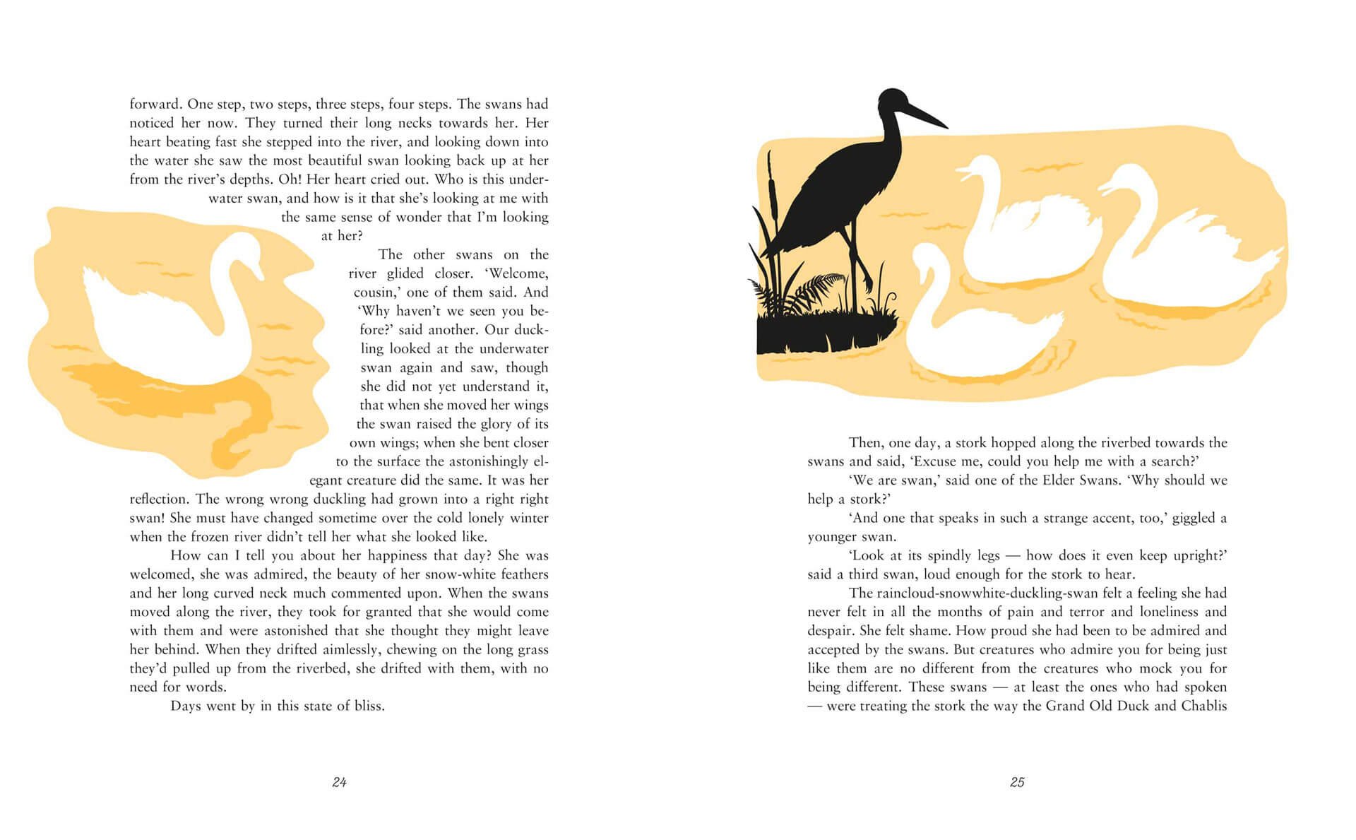
This illustration was created for Kamila Shamsie’s Duckling, part of the Fairy Tale Revolution series published by Vintage Books.

Vintage Fairy Tale Book covers of Blueblood, Duckling and Hansel and Greta
Duckling picture book illustration of the ugly duckling swans and a crane in a river with water and ferns.

The Little Mermaid Creative Process

As we continue to be under lockdown due to the Coronavirus crisis, we might not be able to visit any bookshops in person but the paperback edition of The Little Mermaid was published just last week, so I thought I’d share some behind the scenes sneak peeks of my illustration process.

The Little Mermaid is rewritten by the wonderful Geraldine McCaughrean, based on the original tale by Hans Christian Andersen and published by Orchard Books. With design by the fantastic Sarah Malley.

The Cover

Book cover and back cover for The Little Mermaid Picture Book. A Mermaid illustration swimming in amongst a coraf reef and an underwater palace with fish and a seahorse.

The very first thing I set about doing was deciding what our protagonist, the Little Mermaid would actually look like. I was excited to be able to draw lots of swirling hair and to create lots of fish scale details for her tail- one of my favourite things is adding lots and lots of detailing. I also started to create her underwater sea palace and coral reef setting.

I tend to sketch some things in pencil and then move on to drawing digitally in Adobe Illustrator using a Wacom tablet. I draw a very rough shape before working back in to this to add more detail. I’ll draw all of the elements; characters and background scenery and then start playing around with layering them, figuring out what works best.

Rough illustration of a mermaid and a palace under the sea
The Little Mermaid Picture Book rough sketches of an underwater palace or castle and coral plants

Once I was happy with her general look, I redrew her to fit the cover better, and started to try to frame the title with seaweed. I sketched out a basic seaweed shape, drew this digitally and then thickened the seaweed up, trying to make it look more organic. I then filled the rest of the cover with decorative coral, shells and bubbles.

Rough version of a book cover for The Little Mermaid. A mermaid illustration swimming with fish and a seahorse.

Cover work inprogress

Work in progress sketches and images of The Little Mermaid book cover coming together

Cover sketch, more work in progress and final cover

Inside the book

Here are a few initial sketches and progress images from the interior illustrations, all the way up to final artwork.

Rough sketches and development artwork for The Little Mermaid

Sketch and work in progress

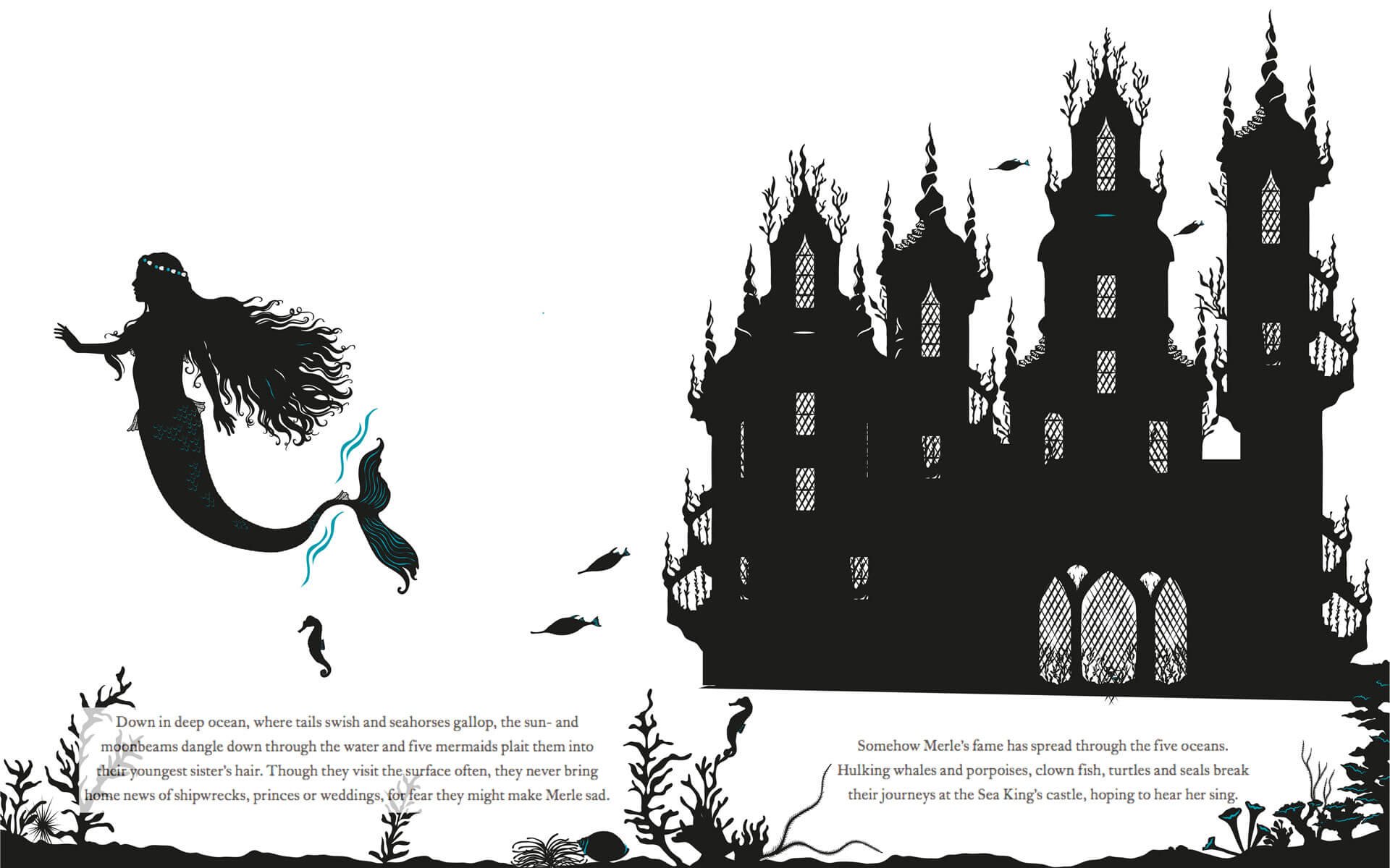
Picture book spread of mermaids swimming in front of a castle under the sea

Final illustration

Sketches from the Little Mermaid picture book. Fireworks on a ship and a mermaid looks on

Sketch and work in progress

Picture book spread of the Little Mermaid and the prince and his ship with fireworks in the sky

Final illustration

Sketches of stormy waters

Sketch and work in progress

Picture book spread of a ship caught in a storm with waves rolling and boat sinking

Final illustration

Thanks for reading! You can see more of my books and other work at https://www.laurabarrett.co.uk/books.