I was thrilled to be asked by Fabian Review to create a cover for their winter edition. This volume is titled Shining a Light, focusing on women’s safety.
I also created a flickering animated thumbnail version.
I was thrilled to be asked by Fabian Review to create a cover for their winter edition. This volume is titled Shining a Light, focusing on women’s safety.

I also created a flickering animated thumbnail version.

I was absolutely delighted to be commissioned by Marks and Spencer to create two illustrated scenes to be printed around their Christmas gin liqueurs.

Copyright Marks and Spencer
The bottles themselves are snow globes- the gin contains edible gold leaf and feature an LED light in the base, so when shaken, they become snowy landscapes. I was tasked with illustrating a winter wonderland of animals and trees, and a festive high street scene, including a little M&S shopfront!

Winter Woodland Illustration Scene

High Street Christmassy Scene
The project was fairly straightforward and the exact type of natural and architectural based work that I particularly love to create. The brief itself contained some mocked up rough versions of the types of illustrations they’d like to see, created by the designer at M&S, Ian Robinson. It included some of my own existing work on similar themes. M&S are also releasing some beautiful biscuit tins in the shape of gable front houses, and I was asked to make sure that some of my buildings in the high street scene were reminiscent of these.
I started out by researching winter trees, birds and other animals that could be included in the woodland scene, and Amsterdam gabled houses for the high street, taking inspiration from a trip there a few years back. I then jumped straight into creating the illustrations; starting with sketches before moving on to drawing with a Wacom tablet in Illustrator and layering the elements together.


I needed to make sure that there was a good ‘flow’ to the illustrations as you twist the bottles around- making sure that the height of the buildings and trees waved up and down dynamically, and that you would be able to see taller ones in the background through the transparent glass. Once I’d drawn all of the elements I experimented a lot with moving the different pieces around; overlapping trees and joining buildings together in a way that was the most effective. The team at M&S were so helpful with feedback on this. The illustrations also had to be seamless where they joined in the middle of the glass, to form one continuous scene on each bottle.

Marks & Spencer have been a dream client of mine for a long time, and this was the perfect brief. It was a wonderful feeling walking into a branch of M&S and seeing my illustrations on the shelves, particularly on such a high end, well produced product. Thanks to my agents at The Artworks!
Here’s a short timelapse video I created to show my illustration process in Adobe Illustrator.
I create silhouettes using a small Wacom tablet- starting with a pencil sketch, I’ll then draw all of the elements separately digitally- characters, background details, etc, before piecing them together and layering them up- almost like playing with the stage set of a shadow theatre. I love hiding really small details in my work and will often find that I’m working on an area of an illustration for ages, before zooming out and realising that it’s only the size of a postage stamp!
Creative Process Timelapse
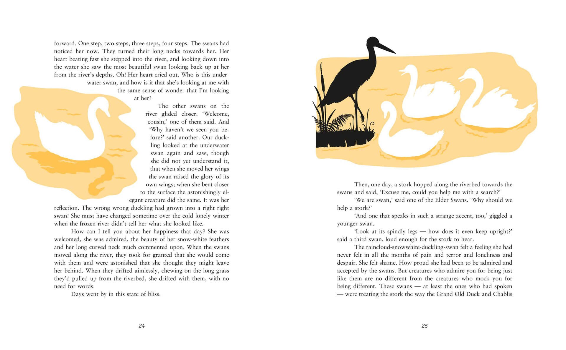
This illustration was created for Kamila Shamsie’s Duckling, part of the Fairy Tale Revolution series published by Vintage Books.


My lovely agents, The Artworks, interviewed me and all of the other talented artists.

You can read more about my workspace, daily routine and creative journey and process here: https://www.theartworksinc.com/2020/07/17/meet-the-artists-laura-barrett/


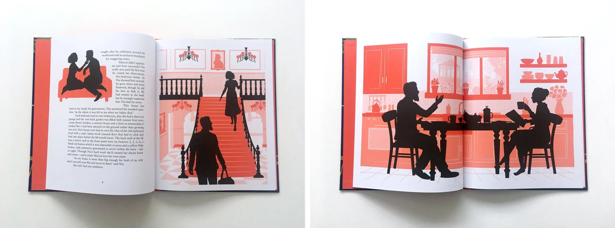
I was thrilled to be commissioned by Vintage Books to illustrate 3 fairy tales that have been given a feminist spin by 3 bestselling authors; Malorie Blackman, Kamila Shamsie and Jeanette Winterson. The tales were Blueblood, Duckling and Hansel and Greta- all modern takes on classic tales.

I created the interior illustrations for the series to go alongside another title by Rebecca Solnit- Cinderella Liberator, which used original illustrations by Arthur Rackham- one of my illustration heroes. It was a real honour to illustrate stories by such well respected authors that I’ve long admired.


Working with book designer Friederike Huber, there was a lot of freedom to work out which parts of the text to illustrate. After reading through the tales several times, along with their original counterpart tales, I noted what I thought were the key scenes and very loosely created sketches for them. Then Friederike created the layouts and, with the team at Vintage, decided which illustrations would fit best. For Duckling, I took a walk around the local lakes in my area for inspiration on the setting, and looked over old photos from trips to forests in the UK and Germany for Hansel and Greta. For Blueblood I looked at a lot of fashion and interior design magazines.

I worked with a wonderful team at Vintage- senior designers Julia Connolly and Kris Potter, editor Charlotte Knight plus Friederike. It was one of those special projects where the working relationship was particularly creative and productive, with lots of ideas being bounced back and forth. The book covers were designed and illustrated by cover designer Anna Morrison- I was tasked with creating silhouette characters to be dropped into her beautiful designs.
The series is published today and available to buy from Waterstones, Amazon and all good bookshops.