I’m excited to share the cover of Fiona Mountain’s new novel The Keeper of Songs, published 2nd July.
It was a pleasure to work with Fiona and cover designer Heike Schüssler AKA Judge By My Covers. I’ve long admired Heike’s beautiful covers and was thrilled to have the chance to work together.
I illustrated the iconic setting of Chatsworth House and the folk singer Molly Marrison, and Heike art directed, designed and illustrated the other elements of the cover.
The novel is ‘a modern day Downton Abbey’, ‘inspired by the work of folk singer Sam Lee’ and is based on real events - the murder of ‘The Runaway Lovers’ in the Peak District.
Thanks also to my lovely agents at The Artworks!
The Jungle Book Colouring & Activity Sheets
As it’s both half term and lockdown here in the UK, I thought I’d re-share the Jungle Book themed colouring and activity sheets I created.
There’s a complex colouring sheet for older ones and some simpler activity sheets for little ones, all downloadable to print for free here: https://drive.google.com/drive/folders/1iAgATT2MVA_EIxYtM4i2EqHkhCK1pcDB
Book Cover Illustration: Marion Lane and the Midnight Murder
Excited to share a new book cover illustration for T.A Willberg’s historical thriller Marion Lane and the Midnight Murder.
Commissioned by Harlequin with art direction and design by the wonderful Kathleen Oudit.
Published by Park Row Books. Thanks to my agents at Mendola Art!
Marks & Spencer Christmas Gin Liqueur Snow Globes
I was absolutely delighted to be commissioned by Marks and Spencer to create two illustrated scenes to be printed around their Christmas gin liqueurs.
Copyright Marks and Spencer
The bottles themselves are snow globes- the gin contains edible gold leaf and feature an LED light in the base, so when shaken, they become snowy landscapes. I was tasked with illustrating a winter wonderland of animals and trees, and a festive high street scene, including a little M&S shopfront!
Winter Woodland Illustration Scene
High Street Christmassy Scene
The project was fairly straightforward and the exact type of natural and architectural based work that I particularly love to create. The brief itself contained some mocked up rough versions of the types of illustrations they’d like to see, created by the designer at M&S, Ian Robinson. It included some of my own existing work on similar themes. M&S are also releasing some beautiful biscuit tins in the shape of gable front houses, and I was asked to make sure that some of my buildings in the high street scene were reminiscent of these.
I started out by researching winter trees, birds and other animals that could be included in the woodland scene, and Amsterdam gabled houses for the high street, taking inspiration from a trip there a few years back. I then jumped straight into creating the illustrations; starting with sketches before moving on to drawing with a Wacom tablet in Illustrator and layering the elements together.
I needed to make sure that there was a good ‘flow’ to the illustrations as you twist the bottles around- making sure that the height of the buildings and trees waved up and down dynamically, and that you would be able to see taller ones in the background through the transparent glass. Once I’d drawn all of the elements I experimented a lot with moving the different pieces around; overlapping trees and joining buildings together in a way that was the most effective. The team at M&S were so helpful with feedback on this. The illustrations also had to be seamless where they joined in the middle of the glass, to form one continuous scene on each bottle.
Marks & Spencer have been a dream client of mine for a long time, and this was the perfect brief. It was a wonderful feeling walking into a branch of M&S and seeing my illustrations on the shelves, particularly on such a high end, well produced product. Thanks to my agents at The Artworks!
Creative Process: Illustration Timelapse
Here’s a short timelapse video I created to show my illustration process in Adobe Illustrator.
I create silhouettes using a small Wacom tablet- starting with a pencil sketch, I’ll then draw all of the elements separately digitally- characters, background details, etc, before piecing them together and layering them up- almost like playing with the stage set of a shadow theatre. I love hiding really small details in my work and will often find that I’m working on an area of an illustration for ages, before zooming out and realising that it’s only the size of a postage stamp!
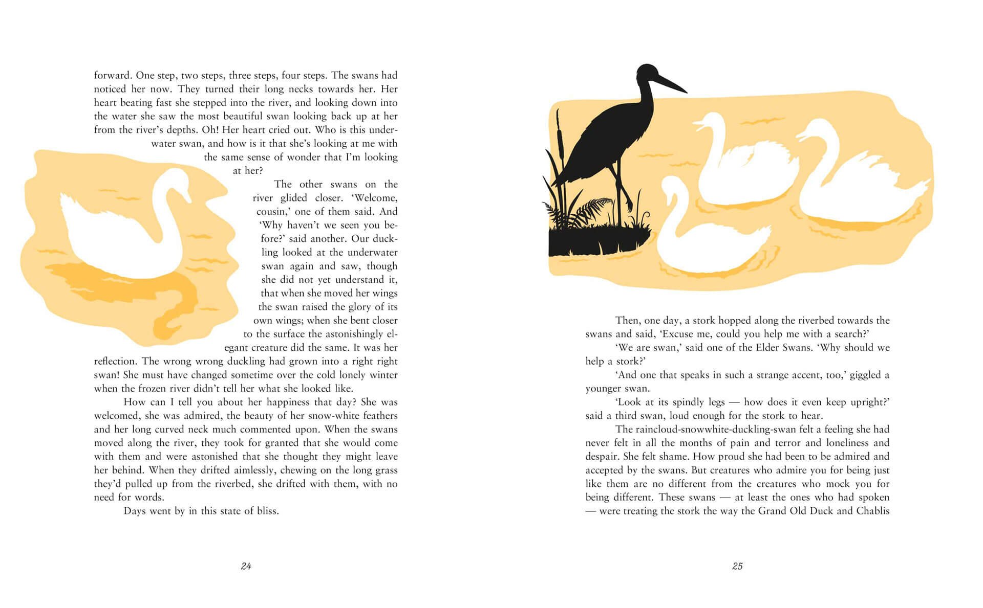
This illustration was created for Kamila Shamsie’s Duckling, part of the Fairy Tale Revolution series published by Vintage Books.
Meet the Artist
My lovely agents, The Artworks, interviewed me and all of the other talented artists.
You can read more about my workspace, daily routine and creative journey and process here: https://www.theartworksinc.com/2020/07/17/meet-the-artists-laura-barrett/
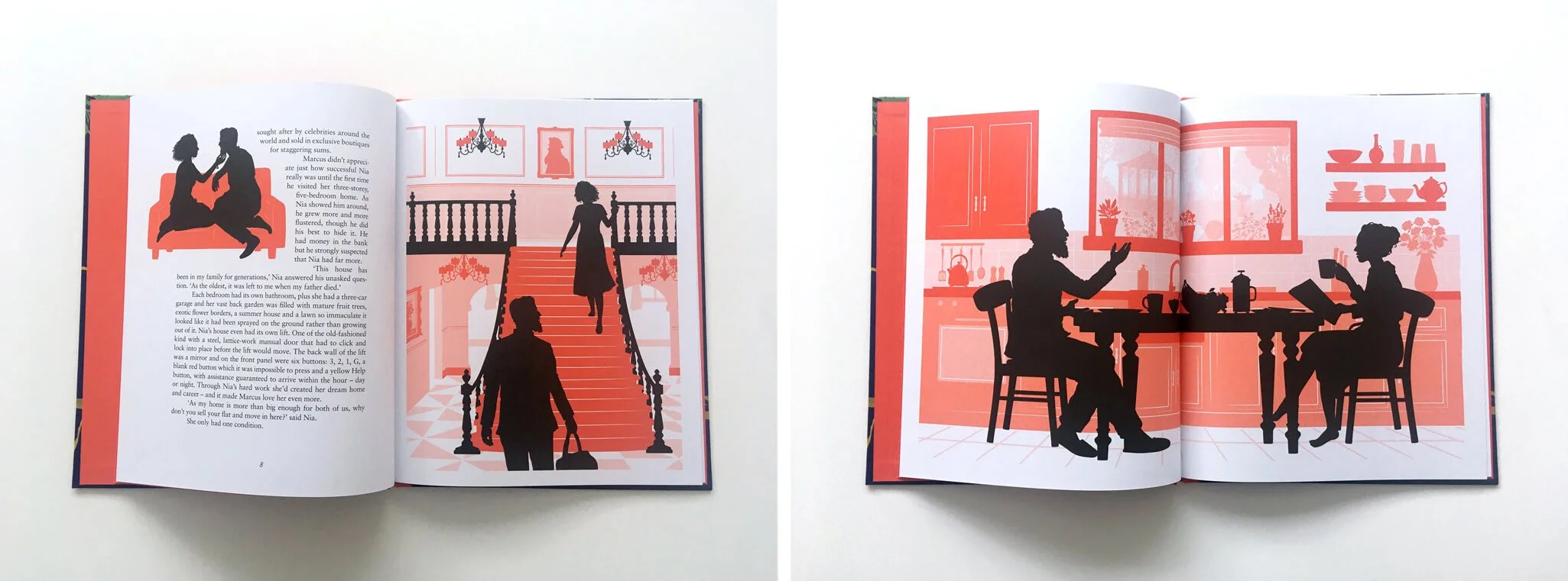
Vintage Books: A Fairy Tale Revolution
I was thrilled to be commissioned by Vintage Books to illustrate 3 fairy tales that have been given a feminist spin by 3 bestselling authors; Malorie Blackman, Kamila Shamsie and Jeanette Winterson. The tales were Blueblood, Duckling and Hansel and Greta- all modern takes on classic tales.
I created the interior illustrations for the series to go alongside another title by Rebecca Solnit- Cinderella Liberator, which used original illustrations by Arthur Rackham- one of my illustration heroes. It was a real honour to illustrate stories by such well respected authors that I’ve long admired.
Working with book designer Friederike Huber, there was a lot of freedom to work out which parts of the text to illustrate. After reading through the tales several times, along with their original counterpart tales, I noted what I thought were the key scenes and very loosely created sketches for them. Then Friederike created the layouts and, with the team at Vintage, decided which illustrations would fit best. For Duckling, I took a walk around the local lakes in my area for inspiration on the setting, and looked over old photos from trips to forests in the UK and Germany for Hansel and Greta. For Blueblood I looked at a lot of fashion and interior design magazines.
I worked with a wonderful team at Vintage- senior designers Julia Connolly and Kris Potter, editor Charlotte Knight plus Friederike. It was one of those special projects where the working relationship was particularly creative and productive, with lots of ideas being bounced back and forth. The book covers were designed and illustrated by cover designer Anna Morrison- I was tasked with creating silhouette characters to be dropped into her beautiful designs.
The series is published today and available to buy from Waterstones, Amazon and all good bookshops.
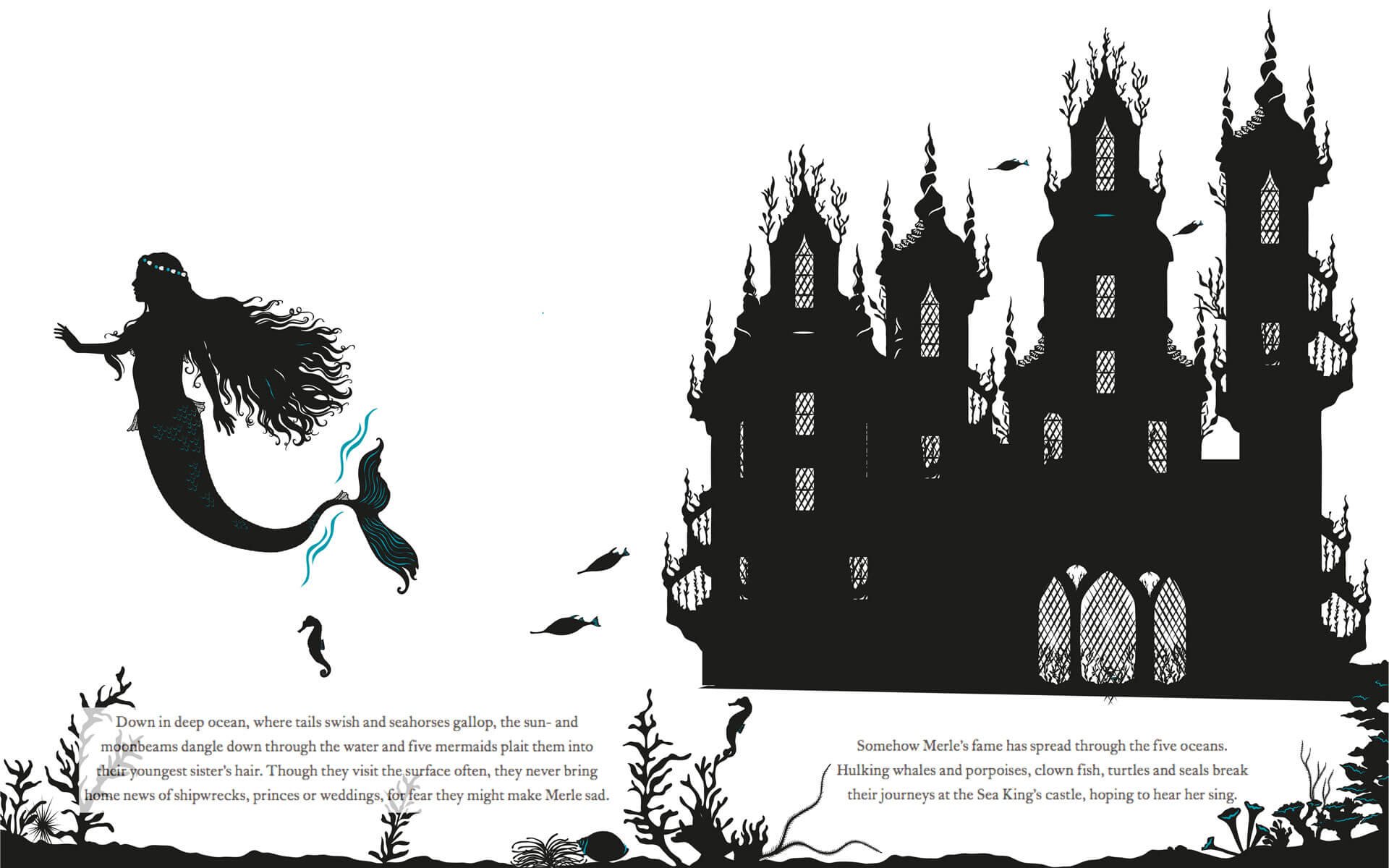
The Little Mermaid Creative Process
As we continue to be under lockdown due to the Coronavirus crisis, we might not be able to visit any bookshops in person but the paperback edition of The Little Mermaid was published just last week, so I thought I’d share some behind the scenes sneak peeks of my illustration process.
The Little Mermaid is rewritten by the wonderful Geraldine McCaughrean, based on the original tale by Hans Christian Andersen and published by Orchard Books. With design by the fantastic Sarah Malley.
The Cover
The very first thing I set about doing was deciding what our protagonist, the Little Mermaid would actually look like. I was excited to be able to draw lots of swirling hair and to create lots of fish scale details for her tail- one of my favourite things is adding lots and lots of detailing. I also started to create her underwater sea palace and coral reef setting.
I tend to sketch some things in pencil and then move on to drawing digitally in Adobe Illustrator using a Wacom tablet. I draw a very rough shape before working back in to this to add more detail. I’ll draw all of the elements; characters and background scenery and then start playing around with layering them, figuring out what works best.
Once I was happy with her general look, I redrew her to fit the cover better, and started to try to frame the title with seaweed. I sketched out a basic seaweed shape, drew this digitally and then thickened the seaweed up, trying to make it look more organic. I then filled the rest of the cover with decorative coral, shells and bubbles.
Cover work inprogress
Cover sketch, more work in progress and final cover
Inside the book
Here are a few initial sketches and progress images from the interior illustrations, all the way up to final artwork.
Sketch and work in progress
Final illustration
Sketch and work in progress
Final illustration
Sketch and work in progress
Final illustration
Thanks for reading! You can see more of my books and other work at https://www.laurabarrett.co.uk/books.
An Inspiring School Visit
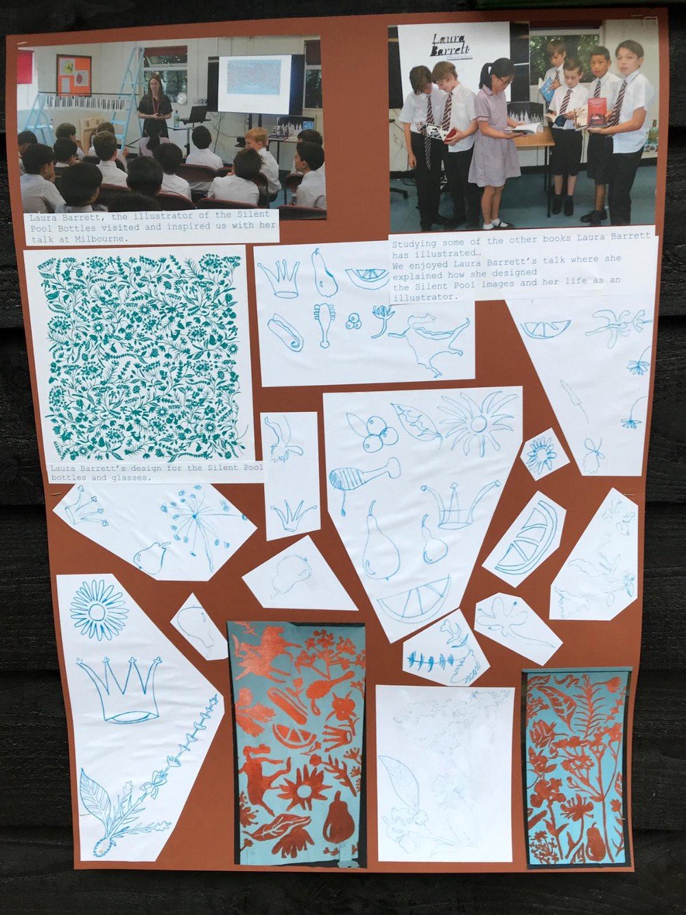
Earlier this year I had the pleasure of visiting Milbourne Lodge Prep School in Surrey.
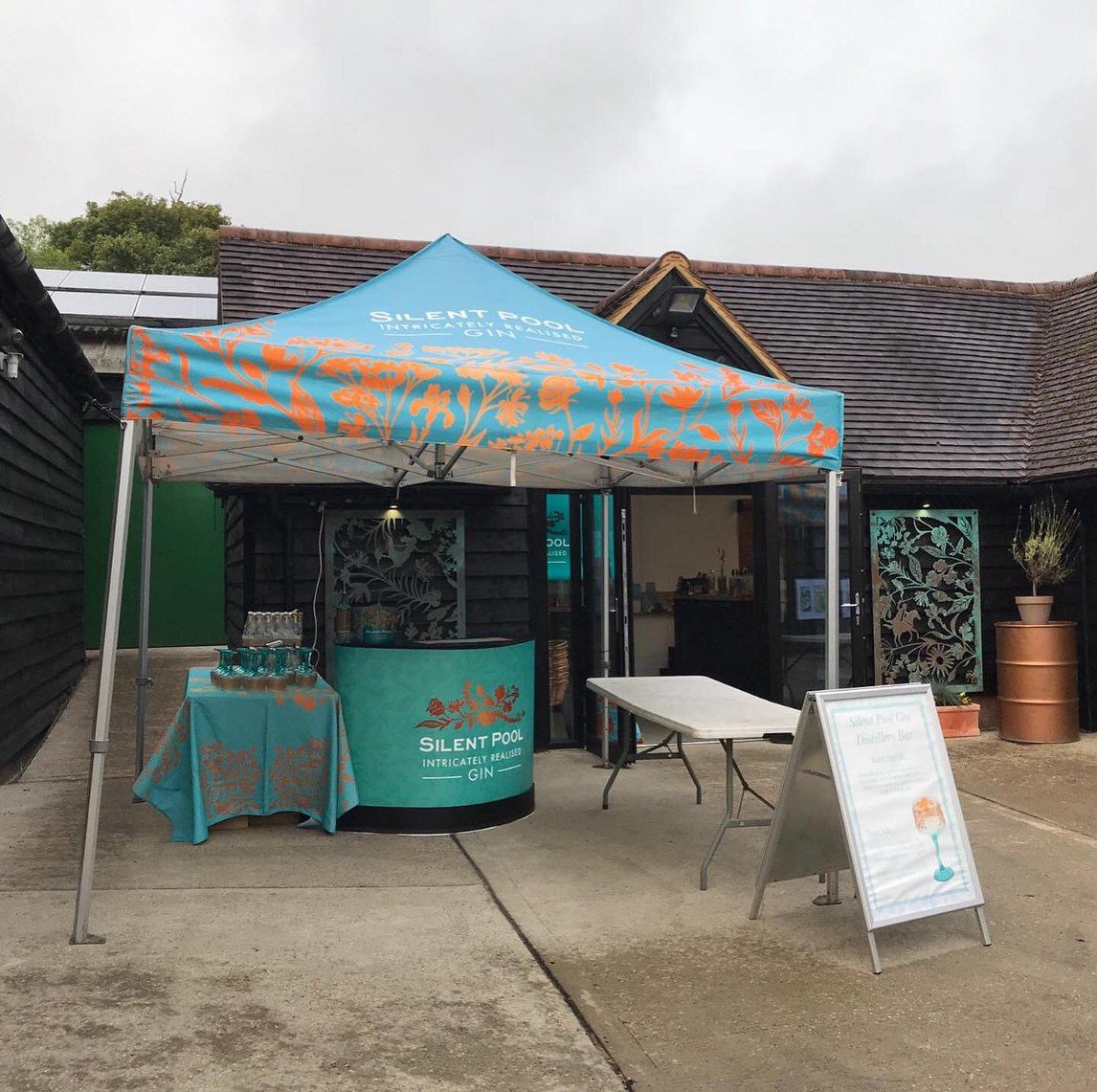
Mrs Bawden, Head of Art invited me to come and talk with the children about the botanical illustration I created for Silent Pool Gin a few years ago, and also about life as an illustrator.
Now, you may be wondering why I was discussing gin with primary school children, so do read on to find out…
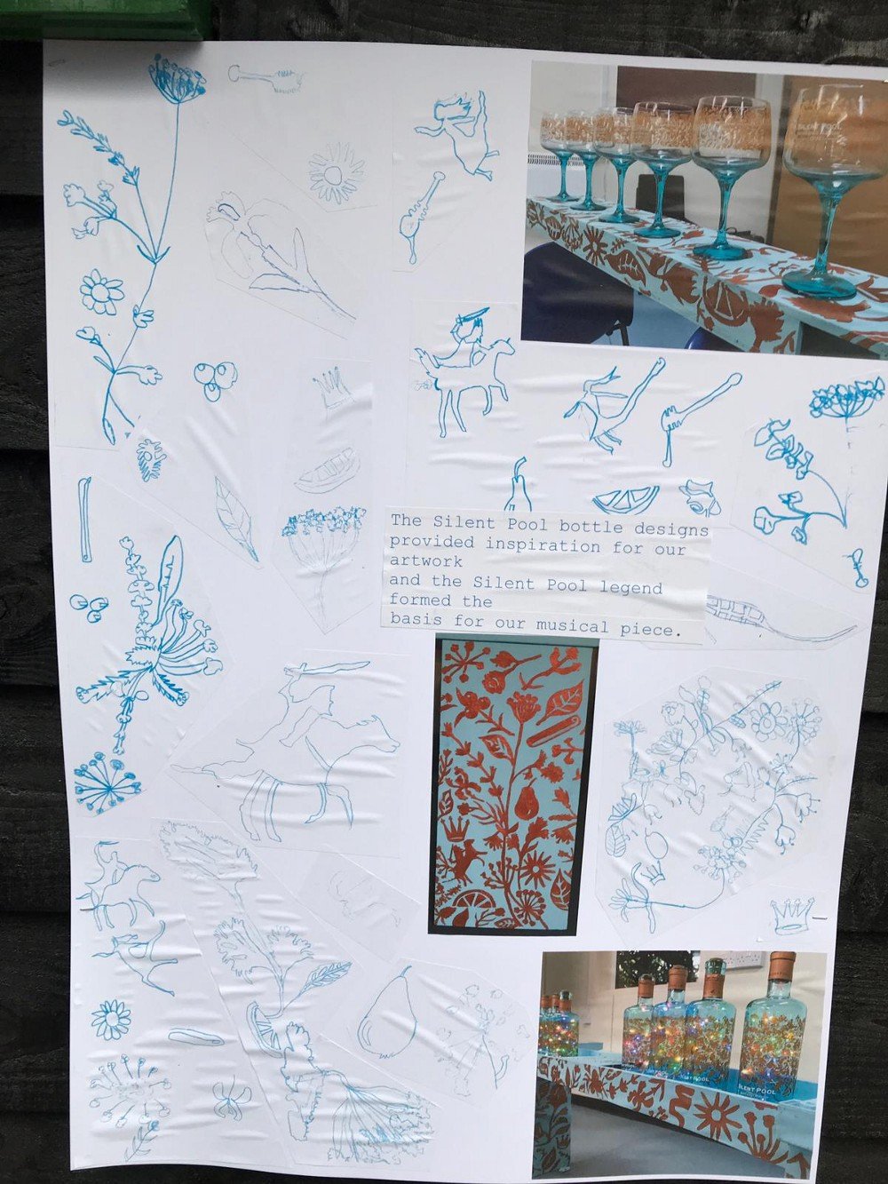
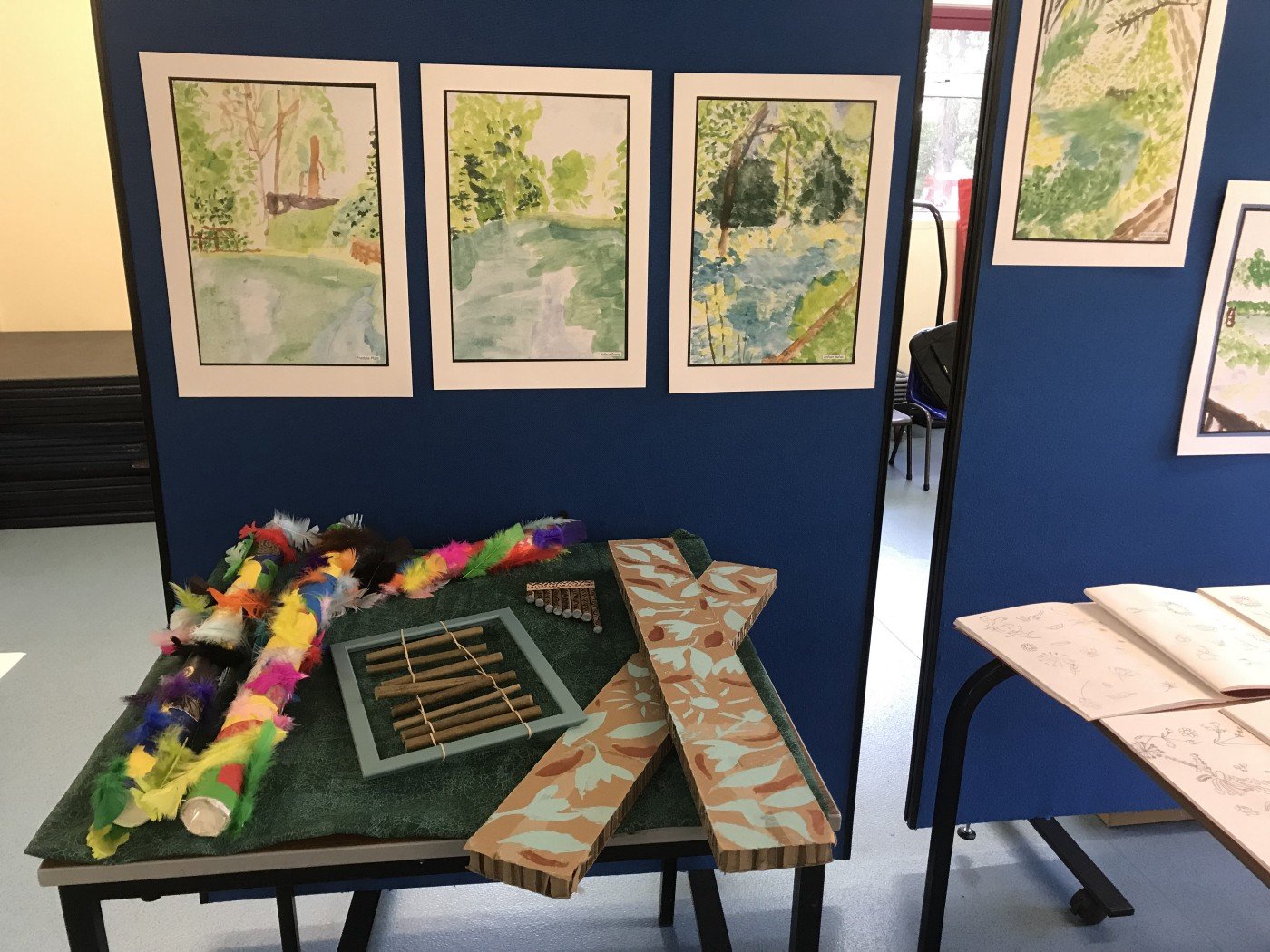
All term, the Year 6 classes had been working on a project called ‘Money Can’t Buy’ within their Art and Music lessons- looking at encouraging the pupils to reuse, recycle and be resourceful and creative.
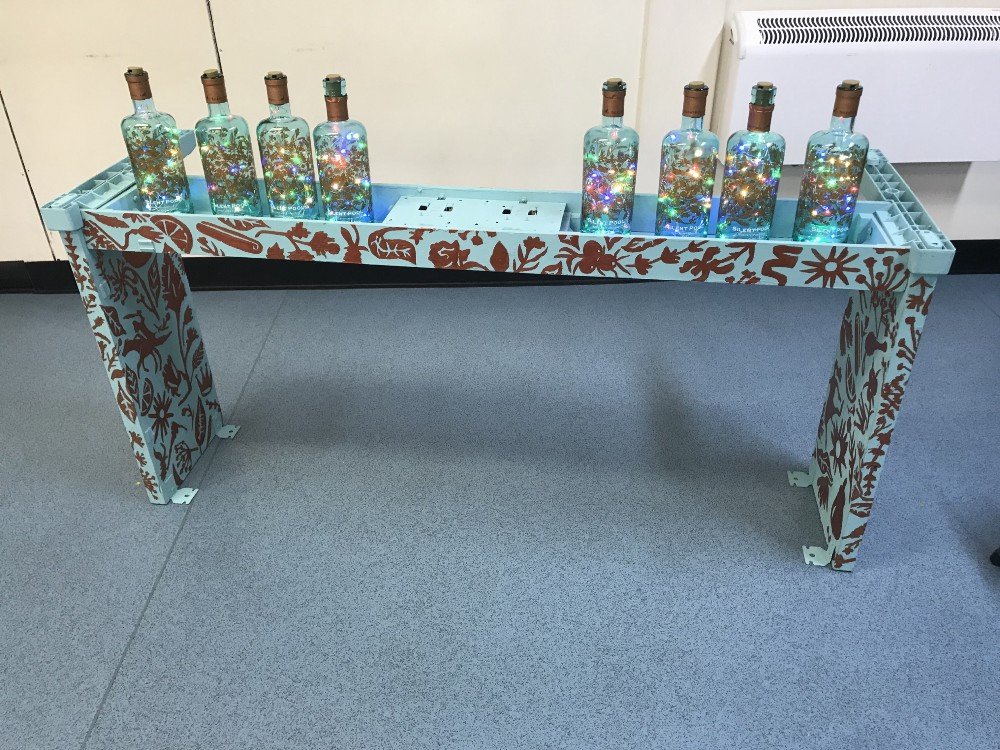
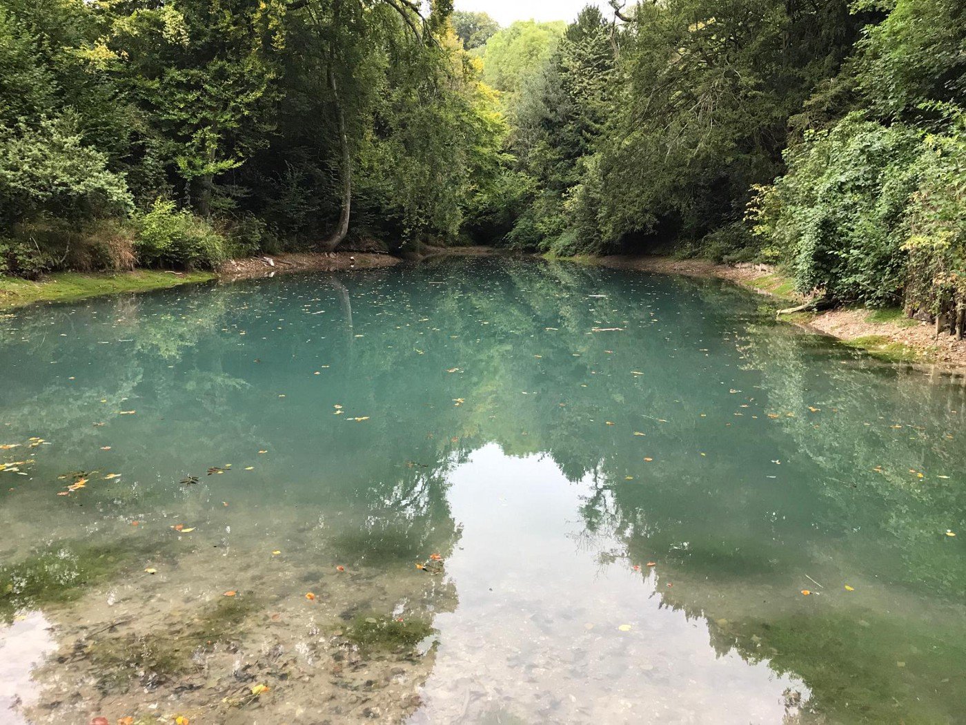
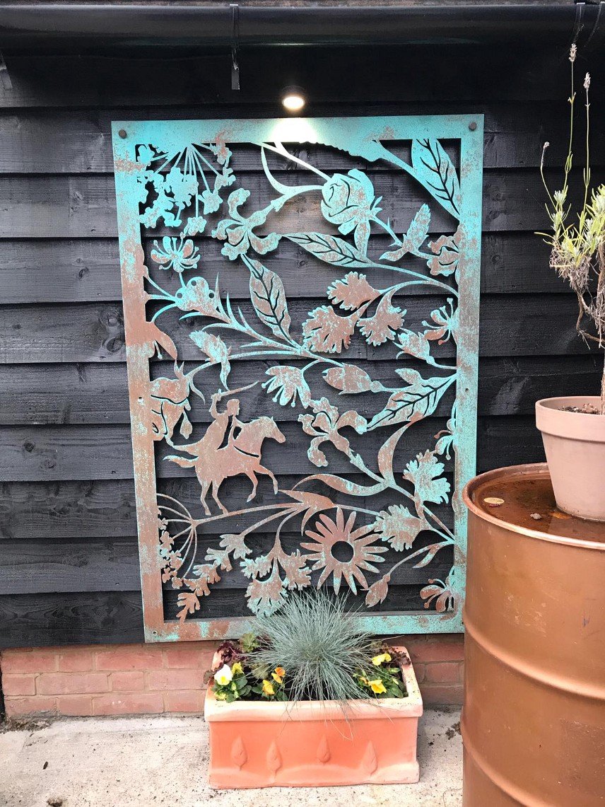
Silent Pool Distillers, who are local to the school had kindly donated lots of empty bottles for them to reuse & work with. The children had been exploring the legend of the actual Silent Pool in Surrey- the 13th Century tale of a young maiden who fell into the lake, scared by the evil King John, riding on horseback.
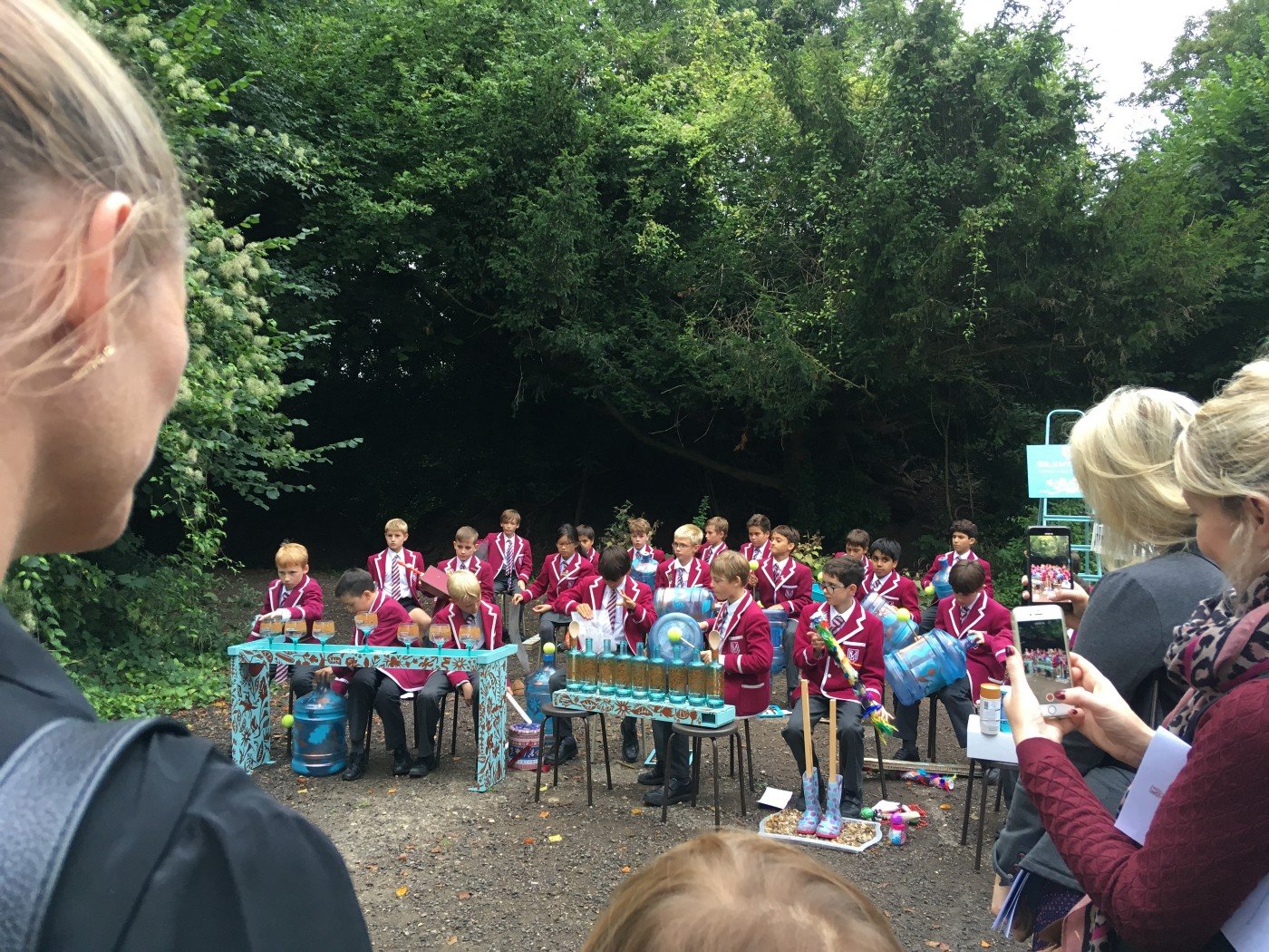
In Art, they made paintings and got creative with the pattern I illustrated for the Silent Pool Gin bottle. In Music, they used the empty bottles, glasses, household objects and even an old piano to make wonderfully inventive and decorated instruments! They then composed a piece of music to capture the Silent Pool legend.
During my talk the pupils were such a wonderful and bright audience, and it was so rewarding to talk to such engaging young minds.
Due to the success of the project, the children then performed their musical composition beside the scenic Silent Pool in Surrey.
It was an absolute joy to hear them perform their beautiful piece of music! Here are a few shots from the distillery- it’s always an honour to see my illustrations in the wild.
School visit photos by Mrs Tiggy Bawden & Mrs Rachel Bowen-Perkins.
Thank you to Milbourne Lodge School for having me.
If you are an educator and would like me to come and speak at your school, college or university just get in touch.


